
Matching algorithms are widely used in observational research, with the aim to balance the two groups of interest in terms of their characteristics, with the ultimate goal to compare those. However, matching can be performed in countless different ways and this may lead to surprisingly different results.
When using observational data with the aim to answer a question on the causal effect of a treatment or intervention, matching tools are often used to create two comparable groups. Starting from the broader sample of the population, these two groups should be balanced in terms of their characteristics, also known as confounders. Confounders are variables that affect both treatment assignment and the outcome. A different distribution of a confounder in the two treatment arms, say age as an example, makes them not comparable and therefore leads a biased estimate for the treatment effect
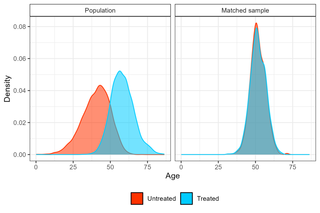
In randomised clinical trials, comparability is induced by randomization, but in observational research this is not possible, for several different reasons. Causal inference tools aim to balance confounders, eventually emulating what a clinical trial would have looked like, if randomization had taken place. Among which matching methods. This is visualized in Figure 1, where the treated arm in the original population is on average older than the untreated one, whereas in the matched sample the two distributions overlap. Matching can be performed with different procedures, the most commonly used is propensity score matching (PSM).
PSM is often the ‘go to’ method chosen by researchers for several reasons, but particularly because it’s widely accepted and not too complicated to understand (and explain). However, if someone was to conduct this analysis from start to finish, it becomes clear how many times the user is asked to choose between many options, even for relatively easy approaches. For those who are familiar with this tool, the first choice we face is which measure to use to define distance between treated and untreated units based on their characteristics, and this often boils down to the absolute difference in their propensity score of treatment or Mahalanobis distance at most.
Choices that follow are whether matching is to be performed with or without replacement, the matching ratio i.e. how many controls per treated unit to look for (usually denoted as 1:k), if a caliper (which is not the distance in probability, but is defined as a certain proportion of the standard deviation of the logit of the propensity score) should be considered and how narrow it should be. Just considering these four inputs, the number of different analyses we can run becomes considerable.
‘Control units needed’, how do I look for those?
One more thing that is worth mentioning is how controls are searched for in the without replacement framework. Different methods are available to conduct the search, but the two most common methods are ‘nearest’ and ‘optimal’, with the first generally being preferred over the second because of the small gain for the latter, whereas it increases the computation time considerably.
However, it does not stop there! The word ‘nearest’ can be misinterpreted when the ratio specified is higher than one (i.e. k > 1), by thinking that two controls are picked at a time, whereas the procedure is actually sequential. This means that controls are picked one at a time for each treated unit and then this process is repeated until all k controls are found for each treated participant (or the control pool is exhausted).
Now, this is to show that although matching on certain characteristics is straightforward and intuitive, the actual implementation is far from it: the analyst is making many choices before they end up with their effect estimate. The final piece of this puzzle, and perhaps the least recognized, is: from which treated unit should the search start?
When matching without replacement, this order determines which controls can be found. In most common statistical software, the search starts from the treated unit with the highest propensity score, as that is considered to be the most complicated to pair up. While generally being accepted, this is still an arbitrary choice, and users can decide to conduct the search in a different way.
Small sample size complications
In ‘big data’ settings, the order in which the search for controls happens might not impact the final results, but in settings without this (data-)luxury, e.g. in the case of rare diseases, treated units might be metaphorically fighting for “good” controls. By now you might have understood where this is going.
What would happen if I repeat the search considering different orderings for the treated units, to study the variability that is, by definition, built into this without-replacement procedure? And once I have done this, how do I convey this information? One could also think to use the ‘optimal’ search, which gives in output the matched pairs that minimize the chosen distance, as that approach does not have this variability. Instead, it is deterministic. However, this is not always possible.
Exploring variability with shuffling and how to visualise it
Given that there might not be a deterministic way to define the matched dataset, we are left with two options: shove these issues under the carpet, or investigate and explain to your readership how influential this variability might be (i.e. because of heterogeneity within the pool of controls, unmeasured confounding or other unlucky reasons). The second is probably the wisest.
We can randomize the order of the treated (i.e. shuffling them like a deck of cards), which might be an efficient way to study the impact of the order in the search, storing the point estimate, the associated standard error and the number of treated units per run that are unmatched. Given a certain number of treated patients, say nT, the number of possible orders in which these can be ordered (in one simple word, permutation) and so the number of times the matching procedure can be repeated uniquely, is nT! It is safe to say that this number reaches impossible heights even after just a few treated patients. Nonetheless, this is worth doing in context in which the disease is rare, if not ultra-rare and the number of treated units is unfortunately limited.
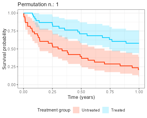
At Amsterdam University Medical Center, we found in our collaboration with clinicians that explaining the reason why this shuffling should be performed is not easy and communicating its impact is even more complicated. However, as anticipated before, when the endpoint of interest is time-to-event, visualization of ‘the data from the matched dataset’ is essentially giving the survival curves, by displaying these datasets that result from the shuffling over and over again.
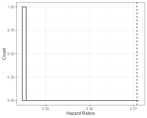
In addition, as to each survival curves there may also be an hazard ratio associated, a histogram can be built, showing the distribution of the point estimates that can be obtained from different iterations. The R library gifski is great for this kind of purpose as it turns all these ‘shuffles’ into short videos, by displaying sequentially the different pictures produced by each matched sample that results from the shuffles. The GitHub repository to reproduce the gif shown below can be found here.
Final considerations
To sum up, matching algorithms are popular and believed to be easy and intuitive, even though the amount of built-in variability that they carry with them is often overlooked and, as a result, not well studied. We discussed that there are many sources of this variability that, especially combined and in small sample sizes, can have a large impact on results of the study.
Our suggestion is to go beyond the classic diagnostics measures that assess group balance and not only perform sensitivity analyses using different matching approaches (which are common) but also the variability as to which controls were matched (which is not common). Both may actually impact the ‘base’ or main case for the analysis, given that we are able to define what ’main’ means in the first place.
One question I am left with is, what do I conclude if results change greatly between one run and the other? That’s a great question, but unfortunately I don’t have a great answer. Perhaps I shouldn’t have – perhaps it is up to the reader, instead.


Add comment